Overall, the map looks ok, but could be better.
The texturing isn't providing a real contrast, except the sand with the rest of the metal textures. Be sure to put a contrast in it as it looks pretty boring right now.
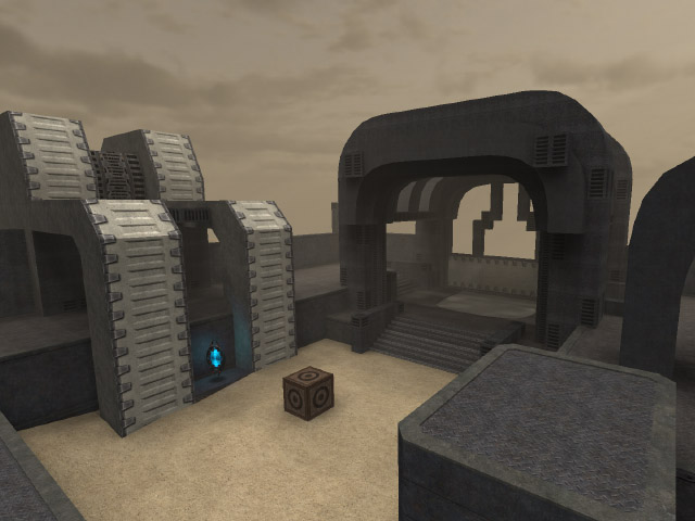
the "e8_btrim03" texture which is on the vertical surfaces of those huge arches, isn't fitting that shape. What about something like I show in the next screenshot?

The map is also lacking blendmaps like in the screenshot below.

Well it could be something like the screenshot which is down this line of text.

The geometry could be better also, as the curves aren't fitting each other at all. A screenshot of it is just right next to this.

I agree with Razgriz, the map could have some more details. This could also be provided with the enhanced texture pack of e8 which I released a while ago.
It's downloadable just right here.
I would like to notify the texturepack doesn't has height-mapped textures (yet), as I wasn't aware of the meaning back in those days. It still gives the map a way more natural feeling when using so.