If this is a map, it could mean a problem with the lighting, texturing, geometry, or layout; try the Cube Wiki for tips on using the engine. Should it be some other form of content, then it may need to be elaborated upon to be worth something.
The layout of a map is among the most important parts of a winning design, try making sure exotic geometry is removed or clipped and the level is open and free of dead-ends or unexplained phenomena.
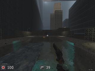
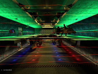
Screenshots let people get a feel for your work, and is the most important part of a node. They should be the correct size, and have no heads up display elements. Refer to the User's Guide for information on how to fix this.
Refer to the Packaging Guide for information on how to fix this.
Refer to the Packaging Guide for information on how to fix this.
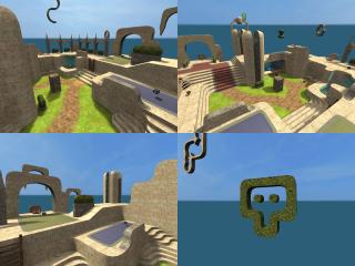
Screenshots let people get a feel for your work, and is the most important part of a node. They should be the correct size, and have no heads up display elements. Refer to the User's Guide for information on how to fix this.
Refer to the Packaging Guide for information on how to fix this.
Screenshots let people get a feel for your work, and is the most important part of a node. They should be the correct size, and have no heads up display elements. Refer to the User's Guide for information on how to fix this.
